Friday, 28 May 2010
Thursday, 27 May 2010
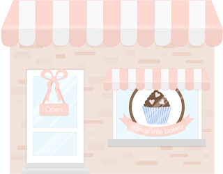
Shop Front Design
Here is the final design for the shopfront for the cupcake store. This will be the starting point to the game. The user will be greeted with a welcome message and then will click on the door to enter the cupcake kitchen.

My own design sketches.
Sugar Animation
Originally when sketching out my inital ideas for the sugar I wanted to use granulated sugar to make it more realistic. However after many attempts are trying to draw sugar grains in illustrator, I had to choose sugar cubes instead.
Perhaps for future improvements the sugar can be changed to granulated sugar.

Wednesday, 26 May 2010
Cupcake Sprinkles - Blue Stars
Sprinkles Sketch
Flour Animation Stages
Instructions

During the game, instructions will be shown on what to do on the current stage. I have drawn a chalkboard which will be placed on the kitchen wall above the worktop.
I originally planned to use a sheet of paper stuck to the wall, similar to that of a recipe sheet which has been ripped out of a book.
I thought the chalkboard design worked well with the asthetics and style of the game. The font used is Bitch Cakes, and was downloaded from dafont.com
Egg Animation Stages
Here are a few of the stages of the egg animation. I drew the stages of the animation in illustrator and then imported them to flash. Each individual image was put onto a seperate keyframe and put within a movie clip.
I found this image particularly hard to draw, especially the egg carton. I tried drawing the carton with and without a lid. I found it hard to get the dimensions right in line with the perspective of the game.


Butter Animation Stages
I drew the stages of the animation in illustrator and then imported them to flash. Each individual image was put onto a seperate keyframe and put within a movie clip.
These images show the butter being sliced and put into the mixing bowl. When the user selects the butter and drags it towards the mixing bowl, the animation will play of the butter being added to the mix.

Saturday, 22 May 2010
Sugar Animation Sketches
1950s style kitchen
Oven Research - Images
For the design of the oven, I wanted to draw influence from 1950s style kitchen appliances. I think this style would fit well into the theme of the kitchen.
Oven Vector Stages
Here are a few screen shots of the stages of the oven being drawn. I am pleased with the overall outcome for the design of the oven.
I found it particulary difficult to get the perspective of the oven to fit in with the rest of the kitchen worktop.
I orginally wanted the design to have a 50s kitchen feel, so I opted for a turquoise green colour after some research on 50s kitch ovens.


Egg Animation
To get an idea of how the animation would work for the eggs being poured into the mixing bowl, I drew a step-by-step animation of each frame.

I also drew a quick sketch of how the eggs would look on the shelf. 2 eggs will be needed for the mixture. The user will be able to indiviually select an egg at a time and drag it to the mixing bowl.
Flour Animation
An animation has been made of the flour bag being poured into the mixing bowl.
White clouds of smoke were drawn in flash in two stages - one at 100% alpha and the other on another frame at 0% alpha.
A motion tween was added between the two stages to create the effect of smoke rising once the flour was poured into the bowl.

Here is a short video taken with my iphone of the flour animation:
Butter Animation Sketches
Here are some quick sketches for the animation of the butter being sliced and put into the bowl of mixing ingredients.
The idea is that the user will select the butter tray with the knife and drag it to the bowl. Once the user has released their mouse the animation will play of the knife cutting a slice of butter and sliding it into the bowl of cupcake ingredients.

Wednesday, 12 May 2010
Selecting the cupcakes - Depth of field
When the user selects a cupcake case from the shelf in the kitchen, I wanted the case to scale larger to have the appearance that it was coming towards you.
1. Actionscript was used to first define the width and height of the cases. This is so that if the case was dropped on stage it would snap back to its current size.
2. Each case is defined as .this, using the variable .this constitues to anything the mouse is clicked on.
3. The script first starts by saying if the cupcake case is clicked and it is moved more than 74 pixels on the Y axis to scale the case by its original size divided by 2.
Image 1: The blue cupcake case is selected and is noticably bigger than the original pink cupcake case.

Image 2: The blue cupcake case gets bigger as it gets closer to the baking tray.
New Icing Bags
After gathering feedback on my drawings, it came to light that my original drawings of the icing bags looked to unrealistic and too square.

I re-adjusted the look of the icing bag and came up with this design:

The Octonauts - Inspiration
Inspiration for the kitchen style was taken from an image in the book 'The Octonauts and the Frown Fish' I used the same style of kitchen worktop to get the appearance of wood.
http://www.octonauts.com/book.html#octoff

http://www.octonauts.com/book.html#octoff

Subscribe to:
Comments (Atom)


